
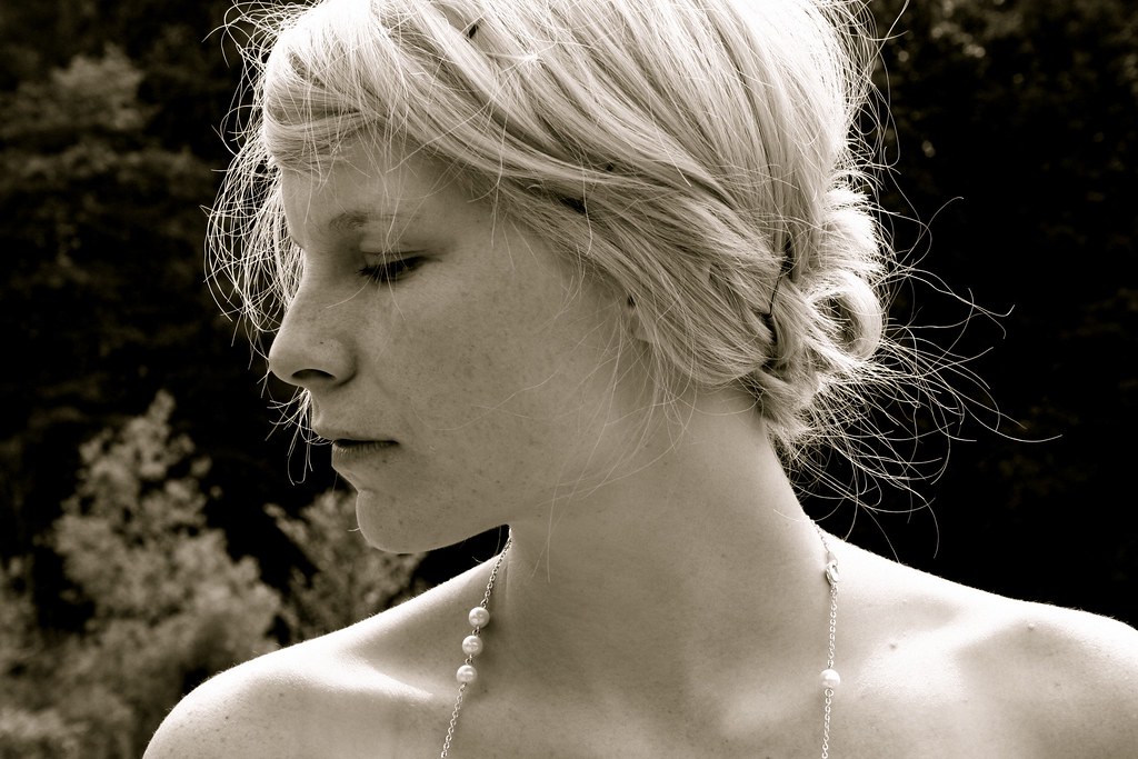
This is one of my favorite photographs that I've taken, of my beautiful friend Amy a couple weeks before her wedding. Bekah's request for some photography pointers the other day gave me the idea for this post. I want to be a teacher; I really love telling people about things I have learned and care about. I am by NO means an expert, but I figured I'd share what little knowledge I do have.
So, from what I've learned through many less than beautiful shots, here are some easy ways to make your photographs better--whether snap shots of your family, or a little something to fulfill that artsy side. And you don't need a fancy-shmancy camera.
Composition: The way you frame a picture and arrange subjects within the shot.
- This is probably the first "rule" (really more of a guideline...you know the old adage...learn the rules so you can break them) you'll find on any photography tutorial on composition. Photography, and all art really, has this thing called the rule of thirds. Basically, it makes sense that you'd want to put the subject right smack in the middle of the picture right? Nope. When the subject, or especially the horizon is dead center, the picture is basically cut in half, and our eyes will quickly get bored. When I think about all of this, I really am amazed at the way God made us to be drawn to beauty. Our eyes are happiest when what they're looking at gives them a path to move and be entertained and...to make a long story short, the rule of thirds helps with that. It is most pleasing to our eyes if rather than placing subjects or lines in the center of a picture, we place them in a third. There is a helpful grid, that many digital cameras actually have a screen mode for these days, to help decode that theory.

- Picture your frame being divided into 9 squares. Any horizontal and verticle lines, such as a horizon or architectural element should lie on the lines of the grid. And your subjects, like the figure and sun in this sketch, should roughly fall on the intersections of those lines. This also creates balance. Here is a photograph that puts this theory to work. When your subject is a close-up of a person's face...the eyes should fall on those intersections.


- The next composition pointer is, keep it simple. Always pay attention to what is going on in your picture besides the actual subject you are trying to shoot. The age-old example of this is a tree growing out aunt edna's head because you have unwittingly placed her in front of a tree trunk in the family portrait. You also don't want a horizon in the background placed directly behind someone's head. Especially when shooting people, keep the background as simple as possible, move them in front of a wall, or blur it with aperture (we'll get to that later.)
- If you can't get a good shot from where you are standing...move. Some of the most interesting shots come from perspectives that are not at shoulder height (being short I really have to remember this.) If you're taking a picture of a little kid, squat down and get on their level. Play around, hold the camera down by your hip and see what you get. Climb on things. Have fun :)
- Look at your favorite pictures and try to figure out what makes them good. Also visit flickr and be inspired--that's how I got into it.
3 comments:
I think you explained that better than our photography teacher did :)
I LOVE your blog!!!! More tips, please! Tiff
look at you...you're a good teacher.
bring it on.
love you and miss you- misty
Post a Comment